
BOSTON SYMPHONY ORCHESTRA
REBRANDING
Like many of its peers, the Boston Symphony Orchestra’s current branding is adequate but unexciting. My general premise was that a world-class orchestra deserves a visual identiy that reflects its stature with just enough edge to appeal to a broader-than-traditional demographic without alienating long-time devotees.
My rebranding started with a logo inspired by elements of the orchestra's landmark home, Symphony Hall. The lettering is taken directly from the large, illuminated 3D "BSO" sign mounted on the north corner of the building facing Massachusetts Avenue. The gold panels surrounding each letter were inspired by the three banks of organ pipes located above upstage center inside the hall itself. Underneath lies five lines, which obviously represent a musical staff and were designed to be variable in length per specific application. Once these elements were skewed together, the lines also imply motion while the orientation of the letters simulates perspective of the sign itself when seen from a distance.
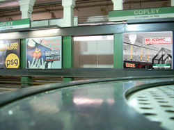
The accompanying stationery suite takes many cues from the logo: the shape and angle of the gold panels recur in various ways throughout, as does the color scheme and typeface. This motif was intended to be easily applied to signage and other environmental design. Finally, a tongue-in-cheek advertising campaign playing up the "SO" in "BSO" completes the project.
 |  |  |
|---|---|---|
 |  |  |
 |  |  |
 |  |  |
 |  |  |
Use side arrows or thumbnails to change images. Click or tap image to enlarge.